Note
Access to this page requires authorization. You can try signing in or changing directories.
Access to this page requires authorization. You can try changing directories.
The graphs experience in the Microsoft Defender portal enables you to perform interactive graph-based investigations on your custom graphs, such as using a graph built for phishing analysis to help you quickly evaluate the impact of a recent incident, profile the attacker, and trace its paths across Microsoft telemetry and third-party data. The graphs experience allows you to run graph queries to visualize the insights that matter most to your organization and supports ad hoc traversal of the graph so you can quickly investigate entities of interest. You can study the graph schema to understand the relationships defined on your graph and use any of the displayed metadata to narrow down your results. You can quickly validate your results with the table view and export them for easy integration into any preexisting workflows. Use Jupyter Notebooks in Microsoft Visual Studio Code to create and materialize your custom graphs, then use the graph experience in Microsoft Sentinel to query and visualize your custom graphs.
Use Microsoft Sentinel graph to query, visualize, and interact with graphs to obtain new insights.
Prerequisites
- To access the graph experience in Microsoft Sentinel and query it to produce visualizations, you must have the appropriate permissions. For more information, see Get started with custom graphs in Microsoft Sentinel. Users of Sentinel Scope can't access Sentinel Graphs unless they hold one of four highly privileged roles that override scoping: Security Reader, Security Operator, Security Admin, or Global Admin.
Access graphs
To access the graph experience in Microsoft Sentinel, sign in to the Microsoft Defender portal, select Microsoft Sentinel > Graphs from the navigation pane.
The Sentinel Graph management page lists all custom graphs you created using the Visual Studio Code Sentinel extension. If you haven't created a custom graph, see Create a custom graph to get started.
If you already created custom graphs, the Graphs page in Microsoft Sentinel displays all available custom graphs. View an overview of each custom graph by selecting the ... menu on any graph tile.

Query a custom graph
Select Query graph on the graph tile to view the graph query page.
View the schema to understand the graph ontology – nodes, edges, and their properties available to query.

Select the Getting started tab
A list of suggested queries appears. Select Edit query for the Visualize any graph query to copy it to the query editor.
- Enter multiple queries manually or select additional suggested queries.
- The editor supports undo (Ctrl+Z) and redo (Ctrl+Y).
- Before running a query, highlight the correct query in the editor.
- When you type GQL queries manually, the editor suggests predictive values based on your graph's schema.
This example query, Visualize any graph, matches any one‑hop connection in the graph, finding a source node, a directed relationship, and a target node. It returns the full nodes and relationship for up to 100 such matches, making it useful for quickly exploring raw graph structure.
MATCH (x)-[y]->(z)
RETURN *
LIMIT 100
For more information on using GQL, see Graph Query Language (GQL) reference.
Select Run GQL query to view your results. You can cancel a query mid-execution. Copy the content of your query editor cell to share or save the query elsewhere.
When the query finishes, the graph visualization appears. Some queries use operators like
COLLECTLISTthat can't be rendered as a graph. These operators are reflected in the table view. In these instances, the graph tab displays a message explaining why a graph can't be renderedSelect any node to view the node details, including the properties associated with that node. Use this information to inform subsequent queries and visualizations.
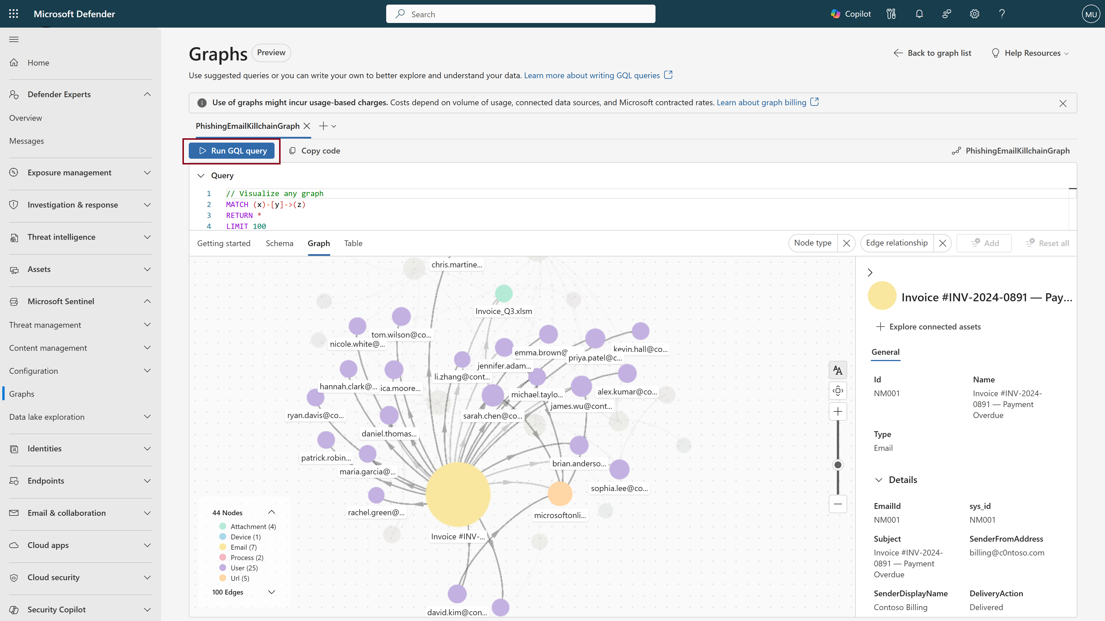
Select the Table tab to view a tabular representation of your results. Select a row to see the underlying JSON data for each cell.


Interact with graphs
Use the following capabilities to traverse and explore your graphs:
Node colors
Nodes are color-coded by type, making it easy to visualize the different entity types in your graph.
Graph legend
The graph legend shows all node types in your graph with their corresponding colors and counts. It also lists all edge types, so you can understand how nodes connect to each other.
Node labels
As you zoom in on the graph, more node labels appear. The first labels to appear are the most heavily connected nodes that are represented by larger circles. As you continue to zoom, more node labels appear in descending order of connectivity.
Hover over nodes
When you hover over a node, the graph highlights its connections and hides unrelated nodes and edges so you can clearly see key information and how the node connects to others. A pop-up box appears showing more information about the node.
Grouping and ungrouping
By default, nodes are grouped on your graph visualization if they are the same node type, and connect to the same origin node by the same edge type. For example, "file" nodes and "accessed by" edges. Grouped nodes are represented by stacked circles on the descriptive layout and diamond shapes on the simplified layout. Node grouping produces a cleaner visualization with fewer nodes, which is important when investigating large graphs. To ungroup nodes, right-click and select ungroup to ungroup all nodes. Select the node group to open a right-hand pane of all nodes within that group. Select individual nodes to ungroup, leaving the unselected nodes in their original grouping. To regroup nodes, right-click on any node that was included in the group and select Regroup.
View node details
Select a node to open a details pane on the right side. Use the metadata shown here to refine future queries—for example, by filtering on geographic region, department, or last updated date.
Explore connected assets
Right-click the node, and select Explore connected assets to traverse the graph and view the next hop from this node. When viewing the detailed renderer, you can also traverse by clicking the plus "+" icon next to a node.

Filtering a graph
You can use the filters at the top-right of the graph canvas to narrow down the visualized results by node type or edge relationship.

Table view
View a tabular representation of your data by selecting the Table tab. From the table, you can:
- Validate that your GQL query produced the desired results.
- Search and sort the table to quickly find entities of interest.
- View the underlying JSON for an individual cell, providing key context that you can use in future queries.
- Export to CSV format for use in other preexisting workflows.

Customize the table format by using the RETURN operator to define the column structure, or order results to your preference. For more information, see the GQL documentation.
Configuration options
On the bottom right corner of the graph canvas, you can customize your graph visualization with a series of configuration options.
Layouts
The first settings button offers a series of customization options for your graph visualization.
Renderer
To accommodate both targeted investigations and large-scale open exploration, the graph uses two different renderers to produce visualizations. By default, the renderer is set to "auto," which means the graph renders based on the number of displayed nodes. Use either the descriptive or simplified renderer according to your needs. The descriptive renderer is best suited for smaller graphs where detailed granularity is key. It includes small enhancements like plus ("+") icons next to each node for easy graph traversal, and grouped nodes are represented by stacked circles. The simplified renderer is better suited for large graphs with thousands of nodes, scaling for open exploration of the presented data, and represents node groups as diamond shapes.
The image below demonstrates the difference between the descriptive on the left and simplified on the right renderers.

Layout
You have the option to change the layout of your graph from "force" (default) to "directed." The force layout automatically displays nodes based on their connections, producing an interconnected graph where anomalies are easy to identify. The directed layout follows a stricter structure, organizing nodes top-down in a clean, linear manner. The image below demonstrates the directed layout.

Behavior
By default, the "Preserve positions on data change" option is selected. This setting ensures that actions like node connection expansion or grouping/ungrouping don't change the positioning of other nodes. Turning this setting off shifts the positioning of existing nodes when these actions are taken.
Actions
Selecting "Realign graph" reverts the graph to its original state.
Layers
By default, both node and edge labels are visible on the graph, as well as icons for pre-defined graphs. Turn off labels and icons from the settings menu.
Enter fullscreen
Select fullscreen to view your graph in full screen mode, providing significantly more space with which to explore the visualization.
Zoom to fit
Select the zoom to fit option to reposition your graph so that all nodes are visible and take up the majority of your graph canvas screen. While the "Realign graph" option reverts the graph back to its original state, this option simply fits the graph (with any moved nodes or other customizations) within your screen.